

Super 98 | Can Layout and Design

One day, at a small local gas station, I stumbled upon an energy drink called “Motor Oil”.
I’m not much of an energy drink guy, but I do like cars and car related stuff.
So I got inspired to make my own, themed by the premium fuel sold in my country.
The Blank Canvas
I launched good old Adobe Illustrator, and got to work.
I got the dimensions to the can/can texture online.
The Branding
To start, I had to choose the product theme.
What are the primary colours? Should I make the can design complex and detailed, or simple and clean?
First, I chose the colours that would be on my design.
The main colours would be a light-ish blue, and teal.
Next, and my favourite part, choosing the font and the typography style.
After going through at least a hundred fonts, I eventually settled with the “Twentieth Century MT” font. I liked the simplicity and boldness of the font.
I typed some text out, laid it out how I wanted to, and adjusted the colours.
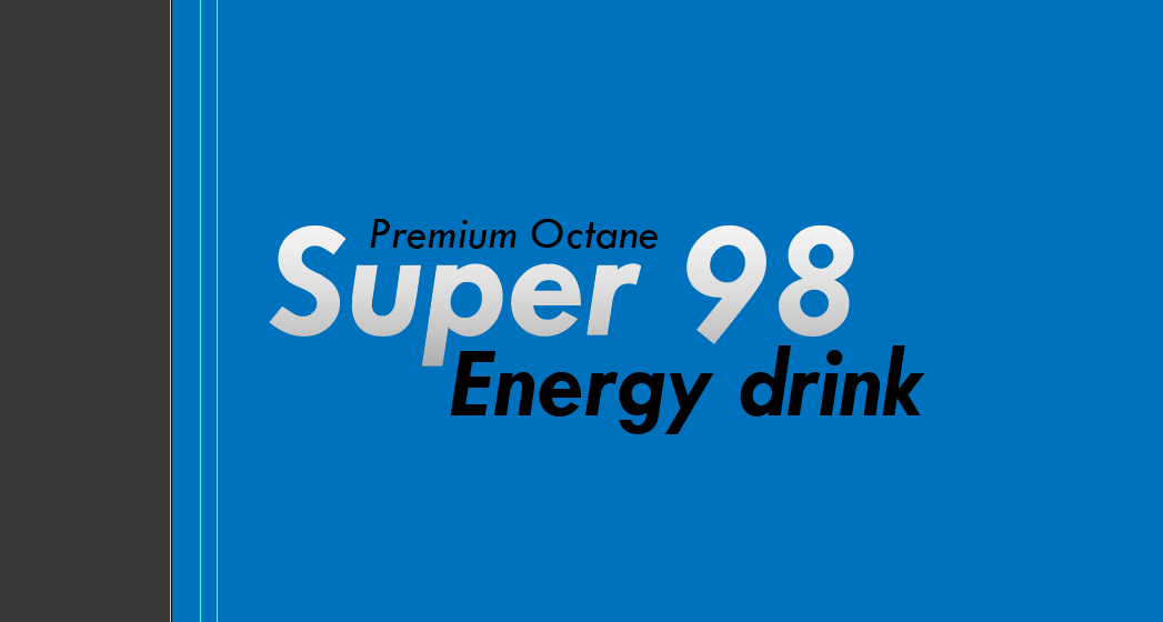
You can see I added a gradient to the “Super 98” text. This is a small note to myself that this text is going to be shiny chrome, but since there is no reflection or light source in Illustrator, This is the closest I will get to simulating that.
Adding Texture
After tinkering around a little while, I wanted to add a liquid texture to the can to further push the fuel themed branding. I couldn’t make a realistic liquid texture, so I opted to make my own water caustic effect.
And so I started working on a pattern that would eventually be my liquid texture.
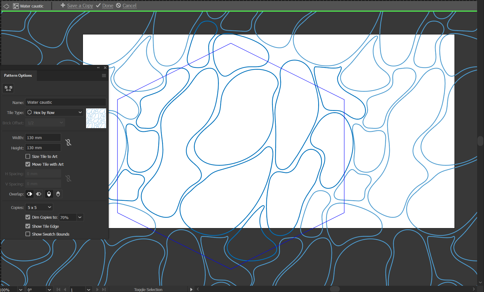

After finalising the pattern and saving it to my swatches, I started working on the shape that I would put on the can.
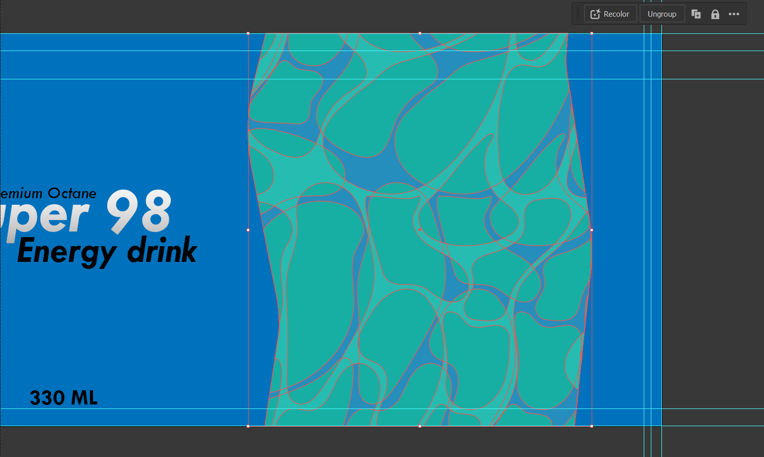
I experimented with a stream of fuel flowing behind the logo, but I found it to be visually distracting and unsightly.
I found the best solution by adding a lake of the texture at the back, where the beverage details would be printed.
I started by drawing and editing the basic shape.

After some trial and error, I got the basic shape and pattern down, and I was happy with how it turned out.
Topping up
After finalising and refining, my custom can design was finished, minus the ingredients list, nutrition table and so on. These can easily be added later and are not essential for now, as this is only a design concept.
Here’s the final design:

Final Words
This design is actually still technically in progress, and I am planning on sticking the design on a 3D model in Blender. Hopefully you had as much fun reading this as I had doing this, and thanks for reading.
-Echo